[footnote]Crystal Peterson took 4110 online in Summer 2015. She produced this lesson for an independent study at NMI.[/footnote]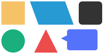 Now that you have dipped your toe into the CSS side of web development, you should be gaining an understanding of just how powerful CSS can be in making your site look how you want. One of the first things you learned was how to create simple squares and rectangles using div tags and the background-color attribute. While rectangles and squares are fundamentally useful in website creation, CSS can be further manipulated to render almost any shape. So with that, let’s take it a step further by using our existing CSS knowledge to transform your div boxes into any shape your heart desires.
The Square Gets an Upgrade.
To begin, head over to free.mynmi.net to download css_shapes.zip, unzip it and, as always, move the unzipped folder (new_shapes) into the mysite folder. Inside you will find two files, newshapes.css and newshapes.html Open newshapes.html with Brackets and you should see that it is already linked to newshapes.css. Now click on newshapes.css and take a look at the first div id listed, which is for “#square.”
Obviously, this is just a simple square, something you’re already familiar with. So go back to your HTML file and add in the code to make the square appear. Remember that the use of a hashtag creates an id rule (as opposed to a class which is designated with a dot), so your code should look similar to this:
<div id="square"></div>
<br><br>
The line breaks using the <br> tag serve to make the shapes easier for you to see once we begin to add other shapes. If you’re not careful and deliberate with your spacing, your custom shapes could end up all jumbled together.
Head back to your CSS file and take a look at the next div tag entitled “#parallelogram.” If you’re not already familiar with the shape of a parallelogram, it’s essentially just a slanted version of a square. We achieve this slanted with a CSS property called transform: skew. The transform property can be used to visually transform your elements in various ways, but for the purposes of our parallelogram, we will be focusing on skew. Skew makes it possible to stretch your element horizontally, and uses degrees to determine just how strong the effect will be.
Before adding the HTML to see the shape, take a look at the CSS. You’ll see the following two lines of code that you may or may not have already seen before:
-webkit-transform: skew(20deg);
-moz-transform: skew(20deg);
The purpose of these two lines is to make the skew effect look the same across different internet browsers. The “moz-transform” targets the type of CSS recognized by Mozilla Firefox. The webkit focuses on browsers such as Chrome. It’s important to include both properties in your CSS to insure that your elements stay consistent across browsers.
Go back to your HTML file and call the div id for your parallelogram. Experiment with varying degrees to change the intensity, and see just how skewed the shape can become. Another thing that’s important to note with shapes that skew horizontally is the page’s padding or margin. If you’re not careful the shape can go outside of the body area. To see what I mean, scroll to the bottom of the CSS document and delete “body { margin: 50px; }” Go view your page and see what happened. Not pretty right? That’s why it’s important to be cognizant of how each element is interacting with the page.
Your Average Square is More Useful than you Think.
Now that you understand some of the ways you can manipulate a simple square to skew in a more interesting way, we’re going to move through the next two shapes pretty quickly. On your HTML document, call the div id’s for both “round” and “circle.” Looking at them on your web page, would you believe that the steps to create both of these styles are incredibly similar? They both utilize the border-radius property in varying intensities.
The border-radius property is essentially a way to round out the corners on your squares. The trick is being able to choose exactly how this property is applied. For rounded edges, just specify a pixel amount. The higher the pixel amount, the more rounded the square will be.
To create a perfectly round circle element, it’s often easier to move away from designating specific pixel numbers and instead take advantage of CSS’s ability to recognize percentages. Setting your border radius to 50% is an easy way to create a circle without doing any math or trying to guess pixels. This isn’t a fail-safe way to create circles however. Just like with everything, sometimes you’ll need to invest some time in trial and error to get it just right.
What if we Half a Square, Then What Happens??
Triangles. Triangles are what happen. To create the triangle shape, you must become familiar with the different ways to manipulate the border property. To form a triangle, you essentially want a box with zero width or height. The actual height of the triangle is determined by the width of the border.
Go back and look at your CSS file under “#triangle”. You’ll see the left and right borders are actually transparent, and that the width and height are indeed zero. The border property is broken up into border-left, border-right and border-bottom to individually manipulate each side. Notice the border-bottom property is the only one with a specified color. This determines the way the triangle faces. Go add the div ID necessary to see this triangle, and you’ll notice that ours is facing upwards. Swap the color and transparency from the border-bottom property to the border-right and see what happens. The triangle points in a different direction. The pixel amount specified will control the overall size of each leg your triangle.
This may seem like some kind of CSS voodoo but there is actually a straightforward explanation; although it can be hard to wrap your head around it and it’s hard to explain. To see an explanatory animation, click here.
[footnote]If a picture is worth a thousand words, think how many words an animation is worth.[/footnote]
Compound Shapes
Not only can CSS be manipulated to create nearly any shape, but those shapes can be put together to create even more interesting compositions. To see what I mean, visit http://species-in-pieces.com/ to see an amazing example of animals created using only CSS.
We won’t be doing anything quite that advanced yet, but we will be putting the shapes we’ve learned in this lesson to use and create a talk bubble using only CSS. If you think about it, a talk bubble is essentially just a square with rounded corners and a sideways triangle put together. We can use those two simple elements to create a fun compound shape you can easily find use for in your web development projects.
To begin, go into the same newshapes.CSS file and add the selector for #talkbubble. Add the necessary properties to create a rectangle with the width of 120px and the height of 80px, and make the corners rounded by 10px. When you’re done, your CSS should look like this:
#talkbubble {
 width: 120px;
 height: 80px;
 background: #536DFE ;
 position: relative;
 -moz-border-radius: 10px;
 -webkit-border-radius: 10px;
 border-radius: 10px;
 padding: 5px;
}
Add the corresponding HTML to newshapes.html to make sure everything’s looking correct. If it is, go back to newshapes.css and add the following at the bottom of the document:
#talkbubble:before {
 content:"";
 position: absolute;
 right: 100%;
 top: 26px;
After that, add the properties necessary to create a triangle with it’s point facing the left. Make the top border 13px, the right border 26px, and the bottom border 13px, and close the tag. The finished CSS should look like this:
#talkbubble {
 width: 120px;
 height: 80px;
 background: #536DFE ;
 position: relative;
 -moz-border-radius: 10px;
 -webkit-border-radius: 10px;
 border-radius: 10px;
 padding: 5px;
}
#talkbubble:before {
 content:"";
 position: absolute;
 right: 100%;
 top: 26px;
 width: 0;
 height: 0;
 border-top: 13px solid transparent;
 border-right: 26px solid #536DFE ;
 border-bottom: 13px solid transparent; }
At this point, you may be wondering how we’re going to have different properties for the same selector. That’s where the “:before” tag comes in. The before tag allows you to add elements to different selections without needing extra HTML. The pseudo element isn’t actually in the DOM, but it will function as if it is.
Go back and add the HTML necessary to call your new selector, and take a look at your new CSS only talk bubble!