Ever had the experience of visiting a website with your phone and such a tremendous amount of tiny content appears that you are forced to move it around on your screen and zoom in and out in order to view it all? Of course you have and chances are you didn’t like it. People view web pages on smartphones, tablets, and computer monitors of various sizes. A properly designed website should work well and look good on all of these devices.
The most common solution for meeting the multi-screen challenge is something called a media query which ‘talks’ to a website visitor’s device to determine its screen size. The visitor receives the same content regardless of whether they are using a phone, tablet, or computer, but, thanks to the media query, they receive a different package of CSS rules based on the size of their device’s screen.
A computer user with a big monitor, for example, may receive a set of css rules that formats the content for a screen size of 1200 pixels wide. Another user with a phone would receive the same content but formatted 480 pixels wide. Designing a website properly for all devices can be quite complex but the concept is simple. In most cases what happens is that large screens display a lot of their content in div tags that are ‘side by side’ which creates the look of columns, while small screens display much of the same content in a ‘stacked’ format. The two figures below illustrate this point.In one first figure, 3 cat photos appear side by side, as they might on a large monitor. The second figure shows the same cat pictures in a stacked format, after a media query rearranged them for a smaller screen.
It is possible to build your own media queries along with customized css rules but doing so is challenging, in part, because of browser compatibility issues. Ie. what works well for Firefox and Chrome, may not work as well for Internet Explorer.
Fortunately, customized frameworks exist that do most of the hard work for you and make it relatively easy to produce a responsive website that works well on multiple platforms. The most popular framework, and the one that you are being introduced to in this lesson, is called Bootstrap.
To get a feel for how bootstrap works, visit http://4110.mynmi.net/demo. The page that appears is formatted with bootstrap, and also shows the width of your browser’s window, at top in bold red text as in
Resize your browser window, make it larger and then make it smaller. As you do so the number that indicates window width should change but, more importantly, the blue div tags underneath the window width indicator may also be changing.
For example, resize your window to something just under 1200 and watch what happens to the first set of div tags underneath; the ones that say 3 large columns. As soon as your browser’s width is below 1200, those columns no longer appear side by side but, instead, are stacked.
Next, resize your window to less than 992 and watch what happens to the second set of div tags underneath that say 6 medium columns. Continue shrinking the window until the 3 small columns break as well and take note of the browser width. But shrink as you may, the extra small columns never break, because they’re not supposed to break.
Now expand that browser window and watch as the div tags once again appear side by side. OK, enough browser calisthenics. Time to make an actual website with bootstrap.
Get Bootstrap
Visit getbootstrap.com and click the Download Bootstrap link which will take you to a page with several confusing options. Choose the first option, shown at right, and click Download Bootstrap. Once the zip file that contains bootstrap downloads, unzip it. A folder should appear with a name such as bootstrap-3.3.7-dist [footnote] the number, 3.3.7 indicates the version, or ‘distribution’ of bootstrap that you are downloading.[/footnote] Copy this folder into your mysite folder and rename it simply to bootstrap.

Now that you have downloaded the bootstrap framework lets take a look inside to gain an understanding of what we have. As you can see there are 3 folders named css, fonts, and js. Ignore the two that end in the suffix .map. for now [footnote] those require too much explanation for this lesson [/footnote] and focus on the other four that end in .css.

Bootstrap.css and bootstrap.min.css are essentially identical and both contain the same set of css rules that provide the ‘standard’ bootstrap layout. The .min version is what is known as minified file, with all of the spaces taken out for faster loading. The bootstrap.css file is designed for humans who want to read and possibly modify the css rules. Both work the same, but the minified version will speed up your website’s performance [footnote] a small amount [/footnote] compared to the human-friendly version. Bootstrap-theme.css provides (optional) advanced styling features such as 3d buttons.
The fonts folder is full of glyph icons that look like graphics when you employ them, but are actually fonts. Why use fonts for graphics instead of actual graphics? Once again, it’s all about speed because fonts have a much smaller file size than actual graphics which speeds up your website’s performance.

The js folder contains minified and non-minified, but functionally identical, javascript files that support built in functions of bootstrap, such as drop down menus. Although they are not included in this particular download, be aware that there are also a number of specialized, and free, jquery plugins that support additional interactive features such as tooltips and image carrousels.
Set Up a Bootstrap Document
The first step in using bootstrap is to create an html document that links to the css and jquery files. The good folks at getbootstrap.com have made that very easy for us. So, let’s visit them once again and click the getting started link (http://getbootstrap.com/getting-started/). Scroll down that page until you find the Basic Template and click the copy button as shown below.

Paste everything into a new document and save it as bs.html inside of the bootstrap folder. Now take a look at the code of this document. The line of code that calls the css file,
<link href="css/bootstrap.min.css"
links to the minified file within the css folder. At the bottom of the document you will see two js links: one to jquery itself from google’s site, and another to bootstrap.min.js from within the js folder.
At this point you have a basic “Hello World” document that has the css and javascript that it needs to serve as a responsive bootstrap page. The next step is to find some bootstrap-ready div tags for adding content. Visit http://getbootstrap.com/css/ and scroll down to the Containers heading. All of your responsive content must be inside of a container div and there a two types. The standard container has a maximum width of 1200px while the container-fluid div expands to fill your browser, no matter how wide. For now let’s use the standard container so copy that one as shown below.
Paste it into your document, just after <h1>Hello, world!</h1> . Scroll down further to Grid System and continue scrolling until you reach the Example: Stacked-to-horizontal heading. This example demonstrates the use of medium columns, the ones that break and stack when your browser window is less than 992px. Copy those and paste them into your document just after the <div class=”container”> tag. [footnote] while you are at it delete those 3 dots [/footnote] Save your document and test it within your browser. Notice that all of those columns do indeed break when your browser window is less than 992px, but Hello World doesn’t do anything because it is outside of the container div.
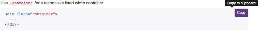
Take a look at the code. Just after the container div you will see a another div titled row as in <div class=”row”>. Inside of the row div are 12 additional and identical divs: <div class=”col-md-1″>.col-md-1</div>, as shown as right. With the bootstrap framework, every row can have up to 12 columns. The 12 col-md-1 (medium) divs shown below translate into 12 individual columns.

Now look at the next row which also has 12 columns. In this case, however, the columns are contained in just two div tags; one with 8 columns (col_md_8), the other with 4 (col_md_8).
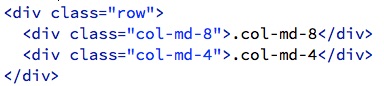
The next row, as you can see, contains 3 divs, each with 4 columns, while the final row, has 2 divs, each with 6 columns. The important message to bring away from all of this talk about divs and columns is that you can use any combinations of divs and columns with a given row, as long as they add up to 12. It is also acceptable to have less than 12 columns within a row, which leaves a gap but still works.
Bootstrap supports even more complex configurations of divs and columns, such as div tags that have 3 columns at one screen width and 6 columns at another, but we will save that confusion for a subsequent lesson.
In this lesson we are going to concentrate on the basics to build a small responsive website that displays side by side divs on tablet-sized and larger screens, and stacks the same divs on screens that are smaller than 768px. One thing to keep in mind before we start: the pictures that you place within a given row must fit within the 768px limit.
Given that there are 12 columns in a row, it would seem logical to divide 768 by 12, and use the resulting number, 64, to decide how many columns to devote to a given picture. That approach has merit but there is one additional piece of crucial information: each div comes with 30px of padding. Therefore, your decision of how many columns to assign to a given picture and how many divs to place in a given row, must take these 30 pixels into account
Use Bootstrap
So far this has lesson has been pretty dry, so let’s moisten it up with an imaginary real world situation. It’s November 30 and your brother-in-law, who always seems to turn to you whenever he needs help, just bought a christmas tree farm and desperately needs a website, now. He knows that you are taking this course and begs you to come through for him with a website that works well on multiple devices. The good news is that you have just learned about Bootstrap and are ready to whip this thing out with a minimum of effort. In fact, you should be able to do the whole thing in about an hours. So let’s get going, time is short.
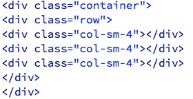
Continuing to work with the bs.html document, delete everything between the .container div tag [footnote] all the stuff you just pasted in [/footnote] and replace it with a div with the row class as in:
<div class="row"> </div>.
Add 3 additional divs within the row div, each with 4 columns, as in:
<div class="col-sm-4"> </div>
When you are done, the code in your document should match the code shown below.
Download xmas.zip from free.mynmi.net, unzip it, drag the freshly spawned xmas folder into the bootstrap folder, and take a look at all of those christmas tree pictures inside. Notice that, in addition to names that indicate what kind of tree it is, each picture also has a number such as douglas_fir_265.jpg that indicates the width in pixels of the picture. This width information will be helpful for deciding upon how many columns to dedicate to each picture and you should thank your brother in law for the extra effort.
Before we go any further let’s use bs.html to create a template for each of the 6 tree types. Save bs.html and duplicate it 7 times, naming each separate file after a tree species, as in: douglas.html, cedar.html, scotch.html, etc., and a homepage named home.html. We will modify each of these pages, of course, but they have everything you need to get started. And remember, we want to do this fast!
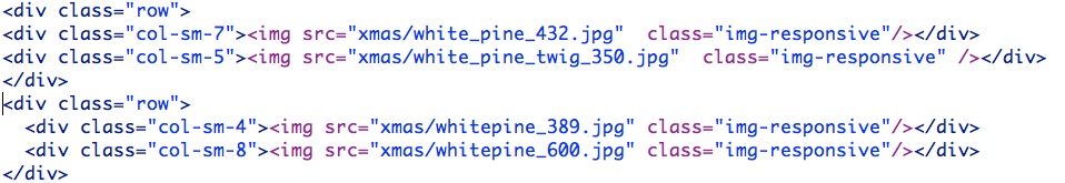
For our first tree we will focus on the Douglas fir, so open douglas.html. If you sort those pictures alphabetically you will see that there are 3 Douglas fir pictures with widths of 204, 265, and 290 respectively. The picture with a width of 204 will fit nicely within a 4 column format, given that 64px * 4 = 256. When you subtract 30 px of padding from 256, the 226px that remains is still more than the width of this picture. The challenge comes from the remaining two pictures, each of which exceeds 226px. Bootstrap offers a nice way around this problem which we will discuss shortly but, just for fun, go ahead and insert those three pictures just as they are and preview the page in a browser to see what happens. The screen capture below shows how your code should look, except that your trees may be in a different order.

While you are previewing, resize the browser until just before the divs reorient themselves and stack. Did they overlap and look pretty awful? There’s a fix for that. Add class=”img-responsive” to each of those images as in:
Save and test once more in your browser. This time the two pictures that are “too big for their divs” should reach their full size when the browser is wider than 991, and shrink to fit within their divs when browser width is less than 991. Take note of what happens when browser width is LESS than 768. Seems like the pictures would stay small, right? Nope, they ‘grow’ once again because once the divs are stacked suddenly there is more space available for each div and the images expand to take advantage of it.
Save douglas.html and move on to the rest of the trees. Your strategy will be similar for all of them: choose a class such as col-sm-4, col-sm-5, etc. that provides the best fit for each picture and insert the images. In some cases, when you have a lot of images for a given species, or a really large picture, you may need to use more than one row. The screen capture below illustrates a two row solution.
Once you finish with the trees, quickly create an atrocious homepage with a variety of tree pictures and captions. If you haven’t already, save everything.
Links
Visit the http://getbootstrap.com/components/ page, find your way to Navbar – Default Navbar [footnote] the url is http://getbootstrap.com/components/#navbar-default [/footnote] Once there, scroll down and look at the example, which contains a kitchen sink of links: Dropdown links, Form links, links that float to the right, links that float to the left; links, links, links! You get the idea. Click the copy tab but before we paste that 53 lines of link code [footnote] yes 53 [/footnote] into our douglas.html document let’s pare it down a bit in a less cluttered environment.
1. Create a new html file. We will use this file for editing but you will throw it away later.
2. Paste the newly copied code into the code side of your now empty document.
3. There is a whole lot of stuff you don’t need here for this particular project but, before we start paring let’s take a look, because you may want it for a later project.
a) Lines 1-2 consist of nav and div tags that define the navbar.
b) Lines 4-12 define a dropdown list of your links that will appear when your document is less than 768px wide. Line 11 has a ‘navbar-brand’ link that is typically used to link to a home page.
c) Lines 15-51 contain a collapsible div tag where the other links all live. As you can see all of the links have unordered list tags (<ul> and <li>) that normally would result in bulleted lists. Because of the Bootstrap’s nav navbar-nav class, those <li> tags take on a very different appearance than a standard bulleted list.
d) Lines 17 and 18 are standard links, followed by a dropdown list that starts on line 19 and ends on line 30.
e) Lines 32-37 contain a search form that theoretically could be used to search your website, assuming that it was big enough to warrant a search feature.
f) Lines 38-50 have another set of standard and dropdown links that float to the right side of your document.
4. Whew! That’s a lot, but the good news is that we don’t need most of it for this project. At this point we could go into a detailed explanation of what to delete and where to delete it, in order to have a simple nav bar but we REALLY want to get this Christmas tree farm finished so let’s make it easy. Visit http://free.mynmi.net/copycode.html , scroll to the bottom of the page, copy the Basic Link Code for Bootstrap, and paste it into douglas.html just below the <div class=”container”> tag.
5. At this point you should have a functional, collapsible nav bar.
6. Take a look at those links you just pasted and notice that one of them has a class called active.
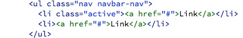
The purpose of the active class, as you may have figured out, is to make it clear to the website’s visitors that this particular link refers to the currently active page. In order to use the active class properly, you will need to apply it to a different link for each page. Otherwise, you will sow confusion and indicate to your visitors that
a. they are on a specific page when they are not and
b. you are too slack to take this problem into account! So do it right.
Just a few more steps and you will be done.
1. Create 4 additional links for your seven page website by copying the final link,
<li><a href="#">Link</a></li>
and duplicating it 4 times.
2. Give each link an appropriate title such as Leyland Cypress or Cedar and link to the other six webpages.
3. Fix the navbar-brand link so that it actually does link to the home page.
4. Copy all of your links and paste them, once again just below the body tag, into the other tree pages and the home page.
5. Move the active class in each page to the appropriate <li> tag.
Headers (Hello Jumbotron)
No self-respective web page is complete without a header and bootstrap offers a couple of simple, but not especially splashy, options. Re-visit http://getbootstrap.com/components/ and click Jumbotron and you will see that one of them is a big gray box. For a more discreet header, scroll down to the next option, Page header. Pick one of these [footnote] your call [/footnote] and use it for your each of your pages.
Once you have finished, you should have a fully functional 7 page website that re-formats itself based on screen width. If it’s not beautiful, that’s ok.